Art Gallery
Digital Painting Part 1
Welcome to the opening of my first ever Art Gallery (Blog post), today I will show you a few of the artworks I have created alongside my major component; A Digital Painting.
Remember the Game of Thrones painting from before, I have yet to fully complete it. However here I will show you a similar Digital Painting of Liam Neeson from the poster for his underrated and under watched film; The Grey. Enjoy this main attraction and more from my gallery;
The Grey Liam Neeson (Digital Painting)
This is the original poster for the Grey.
The Grey Liam Neeson (Digital Painting)
This is the original poster for the Grey.
And this is my work. The first digital painting I did, it hasn't come out perfectly right with some distortions and limitations in the 2D painting format. One of the worst things I did was to gain instructions in creating snow from a sample picture where the snow fell sideways rather than straight, the way it is in the original picture. Still it isn't so bad for a first timer.
Photoshop Poster Design (Avengers 2)
I created this poster as a homework piece in helping me how to learn to use the blending modes on Adobe Photoshop. I cut the Avengers title from the previous films poster and adjusted it to blend with the background picture. With the title I added the sub-title for the movie and did the same, however to a much lesser effect.
The big picture is of Thanos, the purple man seen at the end of The Avengers. I took a smaller picture of him from a comic book cover and cut it out while also resizing it to mega proportions to cover the film poster.
Below you will also see a date tag for the movie, these came from the poster of the first movie with the last number 2 for 2012 being flipped into a 5 for 2015. Cool Huh!
Vector and Clipping Mask (Framing a Picture)
So this picture was adjusted through the use of vector and clipping masks. I'm not going into detail on how to this, but its simple.
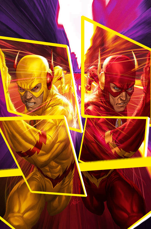
I took a picture such as this magnificent Flash vs. Zoom artwork by Stanley Lau;
I created this through the use of shapes to include a vector mask after which I created a border for the said shape and then linked the layers. I went about copying the original image and sending the copy as the top layer, then hiding the original.
A clipping mask on the copy image layer soon produces framing on the image, which I can place anywhere I like. Then grouping this copied image and the linked layers, I copy the group and move the copied frame to a different position. I do this until I have multiple frames after which I make the original image visible and change its color and tones, in this case making it purple.
Comic Book Cover (Halo Season 1 Issue 1)
This is the cover for my comic Halo set in what I like to call; the Heroverse. I will explain the story including scripting to you in Writer's Block, but before that I will also present you a detailed world building plan on the Heroverse and Halo. It's a passion project which I wish to publish one day as both a comic book writer and artist. Enjoy!
That is it for this week, I'll try see if I can get another art gallery set up for some of the other works you guys might have seen on my SCPC pages, but for now this is it.
'Nuff Said
Aneesh Raikundalia


No comments:
Post a Comment